Chaos Is the Point: Why Gen Z's Love Affair With Ugly Websites Is the Most Honest Thing on the Internet
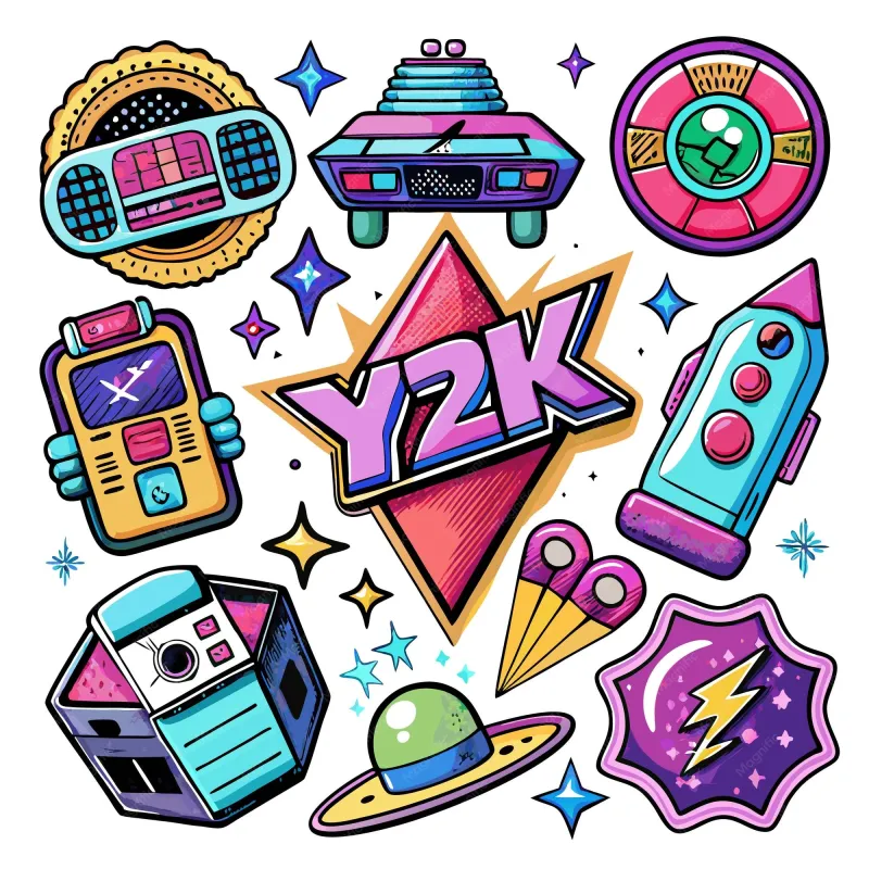
Photo: colorful retro y2k aesthetic glitter digital art creative design collage, via img.freepik.com
Let's get something straight: when a 22-year-old designer puts a glittery animated GIF of a butterfly on their personal portfolio page, they are not confused. They are not unaware that Helvetica exists or that Apple spent decades training the world to equate white space with sophistication. They know exactly what they're doing. And what they're doing is, arguably, more creatively interesting than anything a minimalist redesign trend has produced in the last five years.
The early 2000s web aesthetic — tiled backgrounds, blinking text, Comic Sans, custom cursors that trail sparkles across the screen, MIDI music that ambushes you without warning — has been staging a very deliberate comeback. It's showing up in personal websites, artist portfolios, Neocities pages, indie music sites, and the corners of the internet where people still care more about self-expression than SEO scores. And the people driving this revival aren't doing it ironically, at least not entirely. They're doing it because it works.
The Rebellion That Looks Like a Mess
To understand why this is happening, you have to understand what it's rebelling against. The dominant visual language of the modern web is what designers call "flat design" — minimal color palettes, generous white space, clean sans-serif fonts, and layouts so orderly they could double as anxiety medication. This aesthetic didn't emerge from some collective artistic epiphany. It emerged from conversion optimization, A/B testing, and the slow corporate homogenization of every digital surface that people interact with.
Every major platform — Instagram, Twitter/X, LinkedIn, even Facebook — has converged on essentially the same visual vocabulary. The same card layouts. The same rounded corners. The same muted color schemes. The same fonts. Scroll through enough of it and your eyes start to glaze over, not because the design is bad but because it's so thoroughly, relentlessly fine.
Into this beige landscape walks a generation of creators who grew up watching their older siblings and parents use the internet and who absorbed, somewhere in their cultural memory, the idea that a personal website used to be able to look like a fever dream. And they're asking: why did we stop letting it?
"Intentional Tackiness" as a Design Philosophy
Designers and internet culture researchers have started using the phrase "intentional tackiness" to describe what's happening, and it's a useful frame. The key word is intentional. The chaotic aesthetic of early web design wasn't originally intentional — it was the product of limited tools, limited design literacy, and the genuine excitement of people who had just discovered they could put anything they wanted on the internet. The revival version is something different: it's people with full access to modern design tools choosing to replicate that chaos because it communicates something that clean, corporate design simply can't.
What does it communicate? Authenticity, mostly. Personality. The sense that a real human being made this thing and cared about it. A site that opens with a custom cursor and a MIDI version of a Paramore song is telling you something about its creator that a beautifully optimized landing page never could. It's a little embarrassing, maybe. It's definitely not trying to appeal to everyone. And that's exactly the point.
Creators on platforms like Neocities — essentially a modern spiritual successor to GeoCities — have been building this way for years. Their pages look like the internet circa 2003, and they're proud of it. Browse through Neocities' featured pages and you'll find shrines to obscure anime characters, elaborate personal journals decorated with pixel art, fan pages for musicians who haven't released anything since 2009, and personal portfolios that prioritize weirdness over polish. They all have something in common: you know immediately that a specific, individual person made them.
The TikTok-to-HTML Pipeline
Here's where it gets interesting from a platform perspective. A significant chunk of Gen Z's exposure to early web aesthetics has come through TikTok — specifically through a subculture of creators who make videos about "old internet" nostalgia, walking viewers through Wayback Machine archives of defunct websites, pointing out details that feel alien to anyone who came of age after 2010. The visitor counter in the corner. The "under construction" GIF. The guestbook. The web rings.
These videos consistently perform well, which tells you something. Young people who were literally infants when GeoCities was in its prime are watching them and feeling something — a kind of retroactive longing for an internet they never actually experienced. And a meaningful percentage of those viewers are going from TikTok straight to Neocities or GitHub Pages to try to build something that captures that feeling.
The pipeline from passive nostalgia consumer to active creator is shorter than you might expect. And the skills required to build a basic HTML page — especially with the help of communities that actively share tutorials, templates, and resources — are genuinely accessible to anyone willing to spend an afternoon learning.
Glitter and Gifs as Political Acts (Sort Of)
It would be an overstatement to call animated GIF backgrounds a form of political resistance. But it wouldn't be entirely wrong, either. The clean, minimal aesthetic that dominates the modern web isn't just a design preference — it's a business strategy. Platforms and brands have converged on it because it performs well in testing, it scales across devices, and it keeps users focused on content consumption rather than distracted by the environment. The design is for the platform, not for the person.
Choosing to build something that looks deliberately different from that — something that prioritizes personal expression over user retention metrics, that breaks accessibility guidelines in pursuit of a vibe, that looks genuinely weird on mobile — is a small but real act of opting out. It says: this space is mine, not yours. It's not optimized for you. You might not even like it. That's fine.
There's something genuinely refreshing about that posture, especially coming from a generation that has spent its entire online life inside environments that were designed, at every level, to manage their behavior.
What Old-School Design Nostalgia Means for Personal Homepages
For those of us who actually lived through the GeoCities era — who spent hours choosing between tiling star backgrounds and tiling flame backgrounds, who agonized over which MIDI to embed, who were deeply proud of our visitor counters — watching Gen Z rediscover this stuff is a particular kind of surreal. They're treating as aesthetic source material something we built out of necessity and enthusiasm, without any idea it would ever look like anything other than the present.
But here's what that rediscovery confirms: the impulse that drove those original pages — the desire to have a piece of the internet that was yours, that looked like you, that didn't have to justify itself to anyone — was never wrong. It just got buried under a decade of platform thinking.
The glitter is back. The chaotic fonts are back. The unapologetic weirdness is back. And honestly? The web is better for it.