Nobody Means to Land on Your Error Page. That's Exactly Why It Matters.

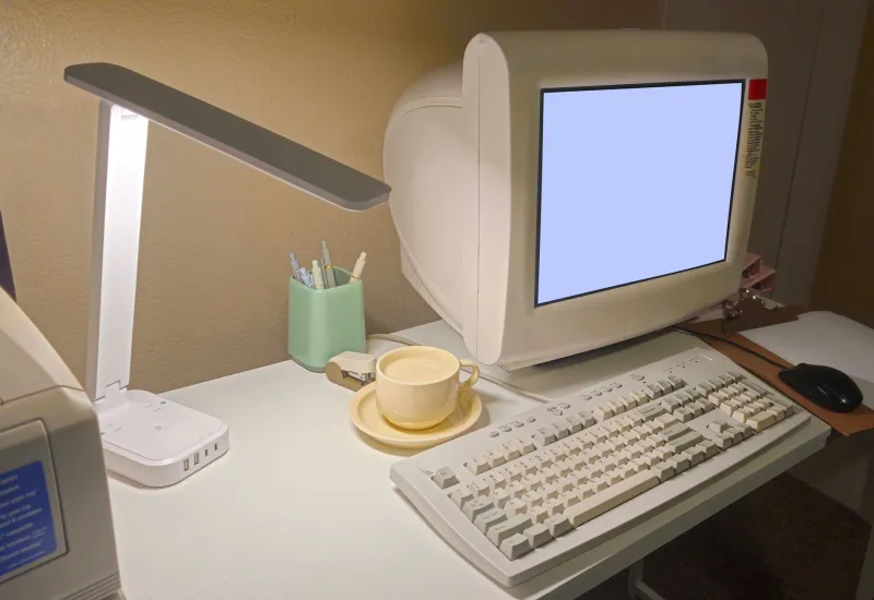
Photo: David Wilson from Oak Park, Illinois, USA, CC BY 2.0, via Wikimedia Commons
There is a specific kind of quiet that happens when a web page fails. You click a link from a forum post written eight years ago, the browser thinks for a second, and then you get a wall of default white with four words on it: Page not found. No logo, no navigation, no clue where you are. Just the digital equivalent of walking into a Walmart after closing and finding the lights half off.
Most site owners treat that page as an afterthought, or worse, as something they'd rather not think about. It's the supply closet of the internet. But I'd argue the 404 is the most honest page on any website, and if you only have one afternoon to spend on personality this month, spend it there.
The page nobody optimizes is the page where you can be a person
Your homepage is doing a job. It's selling, explaining, greeting, funneling. Every element on it has been argued over, and if you've spent any time reading about conversions, you've probably sanded off the interesting parts to make room for a call-to-action button.
Your error page has no job. Nobody arrives with an expectation to be met, which means there's nothing to fail at. That's freedom. You can be funny. You can be a little weird. You can be genuinely helpful. You can put a drawing of a sad robot on it and nobody will call a meeting about brand consistency.
And here's the part that makes it worth the effort: the visitor who hits a 404 is a motivated visitor. They wanted something. That's a rare and valuable thing. A good error page takes that small moment of friction and turns it into a tiny, pleasant surprise, which people remember far longer than they remember your hero image.
An error page is a mood, not a message
The default text exists because it's technically accurate. Your job is to decide what mood the room should have when the lights come on.
A few flavors that consistently work:
The apology with a wink. Acknowledge the failure in plain, human language. This page used to exist. It doesn't anymore, and that's on me. Then give them a way out: a link home, a search box, a short list of the pages people actually want. Self-aware, not smarmy.
The treasure map. Treat the dead end as a detour. Offer four or five hand-picked links — the greatest hits, the weird corner nobody visits, the page you're proudest of. Some of the best traffic on small sites comes from people getting lost on purpose.
The joke that's actually a joke. A pun, a fake error message, a photo of your cat looking guilty. Fine, as long as there's a real link within one screen of the punchline. Humor that traps the visitor isn't humor, it's a prank.
The confession. A short note about how the page broke: I reorganized my folders in March and never fixed this link. Sorry. This one works unreasonably well on personal sites. It's the closest a website gets to a shrug and an honest face.
Whichever you pick, keep the useful bits: a link back to the homepage, a search field if you have one, and a plain sentence explaining what happened. Charm is the garnish, not the meal.
Three technical things people get wrong
First, make sure your error page actually returns an error. A beautiful 404 served with a normal success status code confuses search engines and can leave dead URLs sitting in indexes forever. The server needs to tell the truth even when the page is dressed up.
Second, relative links. If your 404 page is served from some deep folder path the visitor invented by mistyping, a link written as a bare relative path can break. Use full paths for your navigation links so they work no matter where the error fires.
Third, check it on a phone. A lot of custom error pages are designed on a big monitor and then look like a ransom note on a small screen. One column, big type, one obvious way back.
The personality test angle
Here's a game I play when I'm poking around small personal sites: I go to the address bar, type a nonsense path, and hit enter. The 404 tells me almost everything.
Sites with a default server page? The owner probably built the thing and stopped thinking about it. Sites with a wall of technical jargon? Somebody's really into infrastructure, and honestly, good for them. Sites with a handwritten apology and a link to a page about backyard birds? That's a person with a sense of humor and a life outside the browser. I stay longer on those sites. I come back.
No homepage can pull that off. A homepage is a pitch. An error page is a handshake.
Ten minutes, one file, done
You don't need a designer. Make one HTML file, style it however your site is already styled, and point your server's error handling at it. Write four sentences: what happened, that you're sorry, one thing worth clicking, and a friendly sign-off. Add a photo if you've got one. Test it by typing a fake URL.
It's a small page for a small moment. But the internet is mostly small moments strung together, and the sites we love are the ones that bothered to be decent in the cracks.